|
N Rate Calculator Updated
DR. EMERSON NAFZIGER
URBANA, ILL.
Last month (March 2018) we used data from 2017 N rate response trials to update the N rate calculator that provides best-estimate N rate guidelines for different regions and previous crops (corn or soybean) in Illinois. The updating process, which is currently being done by spring each year in Illinois, involves adding the new data and taking out some of the older data.
Many people understand the idea of using data from previous research to try to predict how a management factor will work the next time (in this case, in fields in 2018) – after all, that’s what applied research is all about. But responses to N are highly variable across even nearby fields within a year, and that can make it difficult to place a lot of confidence in the results as a predictor of what will happen the next year. Which N response curve from last year would we expect to do the best job of telling us how much N to use this year?
Let’s use the data from Illinois trials in which corn followed soybean in 2017 to illustrate this. These data (shown in Figure 1) represent a large amount of work; many of these trials were done on farmer fields, organized and conducted by Dan Schaefer of the Illinois Fertilizer & Chemical Association, and some are done within our N research projects at University of Illinois sites. Both IFCA’s and my research projects are supported by the fertilizer checkoff, administered by the Illinois Nutrient Research & Education Council.
In order to show actual corn yields at different N rates, Figure 1 has straight lines connecting the yields, each of which is an average over three or four reps at each N rate. To work with the data, we have the computer calculate a “best-fit” line for each set of data, and the equation for this line produces a smooth curve. That equation is also used to calculate what N rate is required to maximize yield, and what that yield is. We can’t possibly hope to set N rates so that one of them is the “best” rate – we have to produce the shape of the response defined by the actual data points, then work with that.
Each set of N response data shown in Figure 1 has two symbols associated with it. One is a yellow triangle that marks the N rate – and yield at that rate – where the last pound of N produced just enough additional yield to pay for that pound of N. We call this rate the “economic optimum N rate” or EONR. As a default, we often set the cost of 10 pounds of N as equal to the price of one bushel of corn – for example, N might be $0.40 per pound and corn $4.00 per bushel. In that case the EONR is the N rate at which the last pound of N produces a tenth of a bushel of yield. Above that N rate, the cost of added N is not covered by the additional yield; below that rate, each pound of N adds more yield than it takes to cover its cost. In both cases, the return to N is less than it is at the EONR.
Each set of response data also has a green circle (like the EONR triangles, many of these are not exactly on the line because the lines aren’t the fitted curves) that gives the “maximum return to N” (MRTN) N rate calculated by the N rate calculator (the 2017 version, which ran using data through 2016), and the yield at that N rate for that response curve. There are three vertical arrays of the green circles, each corresponding to the Illinois region in which the trials were conducted; MRTN values produced by the N rate calculator decrease from the north (those on the left) to central (middle set of circles) to southern (circles on the right) regions of Illinois for corn following soybean. The green circle shows how well using the MRTN rate would have done in that field in 2017 compared to what we now know (because we had an N rate trial there) was the actual best rate (the EONR, shown by the yellow triangle) in that field in 2017.
At first glance, the fact that the EONR values (yellow triangles) on Figure 1 are so spread out, and that most of them are not very close to the green circle on the same curve, looks like the MRTN rate failed to predict the best N rate for that field in 2017. Of the 51 sites, the actual EONR is to the right of the green circle – that is, the MRTN rate wasn’t high enough – at 21 sites. At the other 30 sites, the MRTN rate was higher than the actual EONR – the yellow triangles are to the left of the green circles. Across all 51 trials, the average MRTN was 172 pounds N per acre, and the average EONR was about 168 pounds N per acre – the difference was only 4 pounds of N. The average yield at the MRTN rate was 226 bushels per acre, and at the EONR was 229 bushels per acre, or 3 bushels more. Using N and corn prices of $0.35 per pound and $3.50 per bushel, using the EONR (which, of course, we couldn’t have known before the season) in each field would have returned about $12.50 per acre more than using the MRTN rate in each field. The two sites with the highest EONR values (those farthest right in Figure 1) by themselves added almost 4 pounds to the average EONR value and almost $3 to the higher return from using the EONR. Though we seldom see such high EONR values, we leave them in the database because they represent possible (future) outcomes, and we can’t justify leaving them out.
Focusing on the yellow triangles in Figure 1 makes clear what we discovered some years ago – that there is no correlation between EONR and the yield at the EONR across a set of N response trials. In fact, a trendline drawn through the EONR values slopes down slightly, meaning that across this set of trials, higher yields needed a little less N than lower yields. The only explanation for this that makes sense is that moisture and temperature conditions that resulted in high yields also increased the amount of N provided by mineralization of sol organic matter, and may also have increased the ability of the roots to get access to that N. At the extremes, in one trial the yield was 278 bushels at 101 pounds of N, and in another the yield was 203 bushels at 226 pounds of fertilizer N. We estimate that corn needs to take up about one pound of N for each bushel it yields. If so, fertilizer provided only 101/278 = 36 percent of the N needed in the first trial, but 226/203 = 111% of the N needed in the second trial.
Even though on average the MRTN performed well in 2017, it clearly did not do so in every trial field, or even in most of these fields. This points out a fundamental difficulty that dogs every attempt to predict “best” N rates for a field or for different parts of a field: nothing we have been able to measure predicts with any accuracy how much N from fertilizer a given field will need at the start of a given season. With yield goal as a basis for N need pretty much sidelined by the finding that higher yields don’t need more N than lower yields, and with both yields and N responses highly influenced by (unpredictable) weather, what can we use to predict how much fertilizer N a field will need?
One such possibility is a way to predict how much N will come from mineralization of soil organic N, which by subtraction could help estimate how much fertilizer might be needed in a field. Another is a way to estimate how much N is lost due to unfavorably wet weather before the plant has a chance to take it up. These attempts have so far not been very successful; we still don’t have a way to know, in May or June, whether the crop in a field needs 120 pounds of N or twice that much to produce the yield it will produce this season. Our best guess today is the MRTN, perhaps tweaked up or down depending on circumstances. Each MRTN value has a range of about 15 pounds of N on either side over which we expect return to N to be very close (within $1 per acre) of the return at the MRTN.
Updating the N rate calculator with recent data and dropping out some older data doesn’t change its output by very much in Illinois, because we have so much data already there: there are 267 N responses for corn following soybean in the database for central Illinois alone. The update this spring added about 3 pounds of N to most MRTN values using current N and corn prices. At $500 per ton of ammonia and with corn at $3.85, the MRTN for corn following soybean in central Illinois is 183 pounds per acre. That rate is expected to produce 99 percent of maximum yield; by definition, the optimum N rate never produces maximum yield because the last N has to pay for itself, and only if N were free would that be at the rate needed to produce maximum yield. The range over which the return to N would be expected to be within one dollar per acre of the maximum is 168 to 200 pounds of N per acre.
Other numbers produced by the calculator include the cost of N at the MRTN ($54.90/acre), the amount of material needed (223 pounds of ammonia), and the net return to N at the MRTN ($314.62 per acre.) Note that the calculator subtracts the yield without N from each N response – the return to N is only the yield added by fertilizer N times the corn price minus the MRTN N rate times the price of N. With the N cost of $54.90 per acre and the gross return of $314.62 + $54.90 = $369.52, we can calculate that this amount of N increased yield by $369.50/acre ÷ $3.80/bushel = 97 bushels per acre. The “true” nitrogen use efficiency (NUE) is the MRTN divided by the amount of yield added by N, or in this case 183 lb. N/acre ÷ 97 bushels/acre = 1.9 pounds of N for each bushel added from using N fertilizer. We often just divide N rate by yield for a field because we can’t know what the yield was without N, so when yields are high and N rates reasonable, we typically have NUE values of only 0.7 or 0.8 lb. N per bushel. That’s helpful in that it helps us see that we don’t need such high N rates to get high yields. But it includes the N supplied by the soil, not just that added as fertilizer. ∆
DR. EMERSON NAFZIGER: Research Education Center Coordinator, Professor, University of Illinois
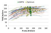
Figure 1. Nitrogen rate responses of corn following soybean in 51 on-farm trials in Illinois in 2017.
Yellow triangles show the calculated optimum N rate (EONR) and yield at that rate for that trial, and the green circles show the MRTN rate and the yield at that N rate.
|
|